“Stone gives a house its gravity. Everything you add afterward should be lighter than the stone.”
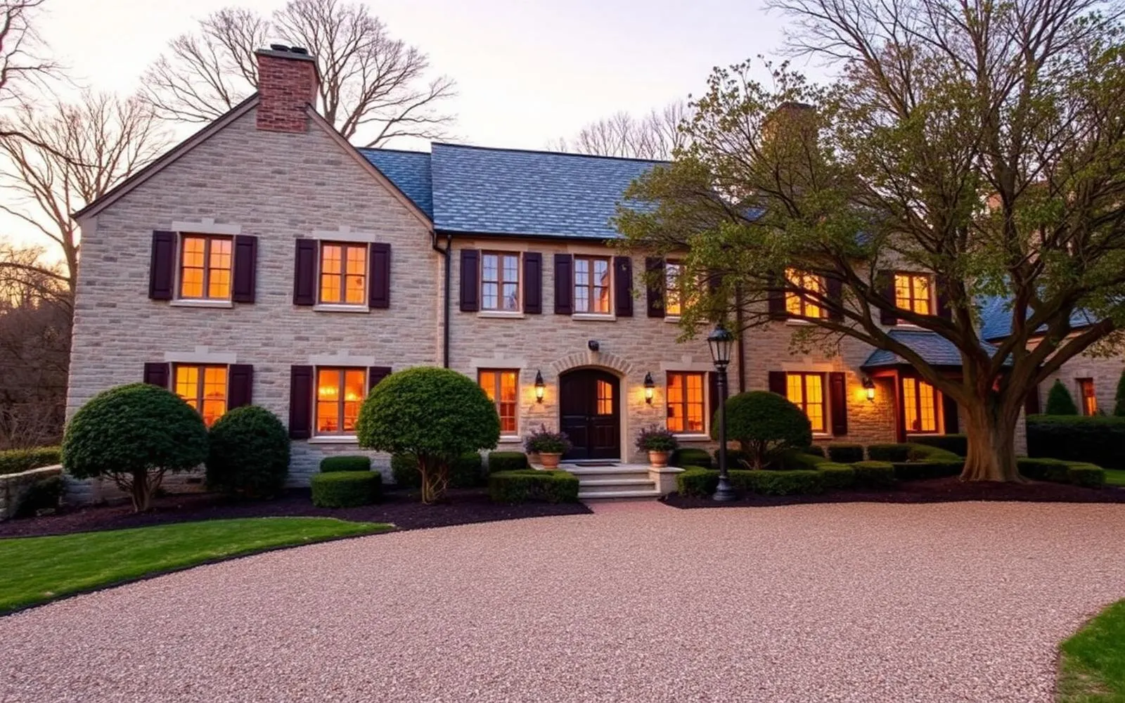
Drive the back roads of central Bucks County and the houses read as part of the geology. The local stone is not one color, and that is what makes the walls interesting. Grey, buff, rust, and near black sit next to one another in the same elevation, and the mortar joints between them do as much visual work as the stones do.
These houses have been photographed and admired for a century, which has produced a hazard. It is very easy to buy one and then decorate it into a costume. The best of them avoid that fate by doing less rather than more.
Let the walls be the loudest thing
A stone exterior has an enormous amount of visual texture. Set anything busy against it, elaborate shutters, ornate lighting, heavy plantings in five different colors, and the eye stops being able to see the wall. The most satisfying stone houses tend to have very simple trim, painted in one quiet color, and a limited palette of plants around the base.
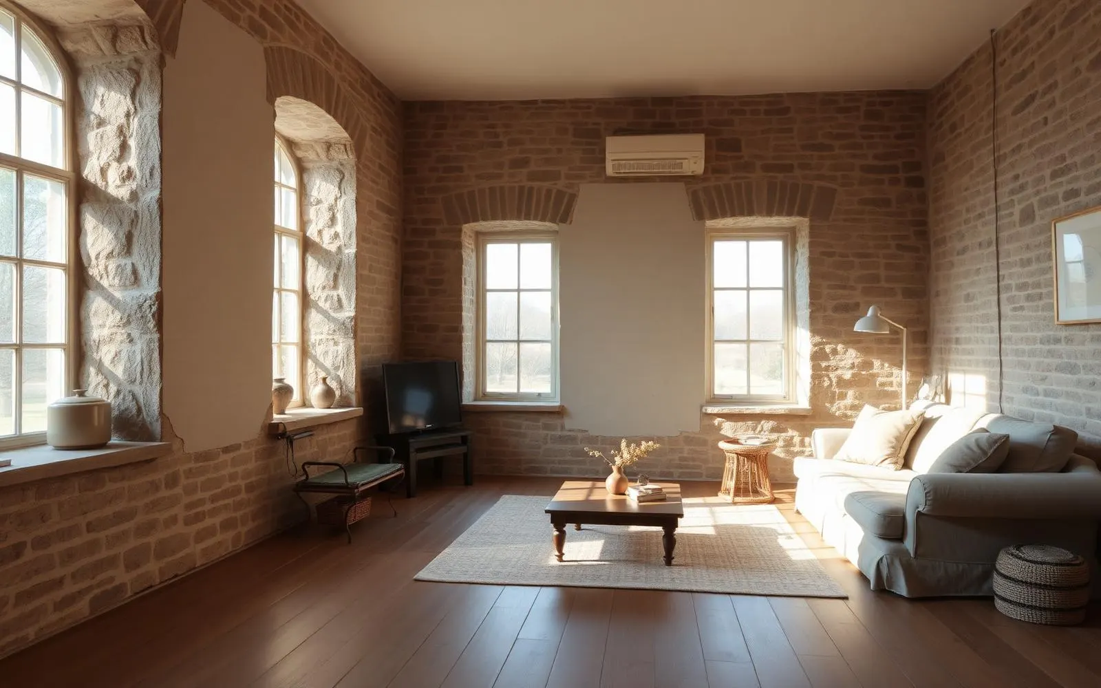
Inside, the same rule holds. If a room has an exposed stone chimney breast or a wall of original masonry, that surface is the pattern in the room. Plain plaster on the other walls, a solid or nearly solid rug, and furniture in undecorated fabrics will read as generous rather than plain, because the stone is already doing the work.
Deep openings are the best feature you own
A thick stone wall makes a window into a small architectural event. There is a reveal, a seat depth, a change in light quality as the sun moves across the splay. Painting those reveals a pale, warm white and leaving them almost entirely uncovered turns each window into a lantern in the afternoon.
Heavy stacked drapery works against this. If privacy is required, a simple interior shutter or a fabric shade mounted inside the reveal keeps the depth visible. The most common mistake is hanging curtains outside the opening, which flattens the wall to the thickness of a curtain rod.
Wood, and the argument for fewer species
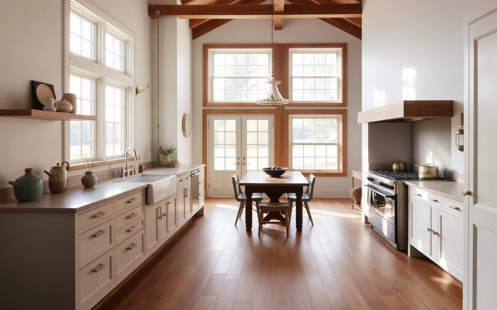
Old houses accumulate wood: original floors in one room, a later oak floor in another, a beam that was always exposed, a mantel someone brought in from somewhere else. When every piece is a different tone the room begins to feel like a lumberyard sample board.
A useful discipline is to allow two tones and no more. Choose the floor and the structural timber, let those be the woods, and make cabinetry, doors and built ins painted rather than stained. The result is calmer, and it also makes the genuinely old pieces legible as old.
Two woods, one stone, one plaster. A historic house rarely needs a fifth material to feel rich.
Landscape as a frame, not a decoration
The strongest settings for these houses look almost accidental: a mown clearing, mature trees at a distance, a low hedge or a stone edge near the walls, and gravel where a car has to go. That restraint is deliberate. Foundation plantings that climb the wall obscure the base of the house and hold moisture against it. Keeping the ground plane low near the masonry is both a design decision and a maintenance one.
Where a garden is wanted, giving it a defined room of its own, away from the house wall, tends to work better than wrapping the building. The house then reads as an object standing in a landscape, which is exactly what it was.
Light: warm, low and layered
Stone and plaster both eat light. A single bright ceiling fixture in a room with masonry walls produces glare on the floor and gloom at the corners. Table lamps, wall mounted fixtures near eye level, and a low warm color temperature give these rooms the depth they had when they were lit by fire and oil.
Outside, the same logic argues for very few fixtures at low mounting heights. A stone facade washed in floodlight looks like a monument. The same facade with two soft lights near the door looks like a home someone is inside of.
What to leave imperfect
There is a difference between repair and erasure. A cracked stone that is stable, a floorboard worn thin in a doorway, a door that has been planed to fit its frame for two hundred years: these are the marks that make a house feel lived rather than staged. Fix what is failing, stabilize what is moving, and leave the rest.
The houses that hold up best are the ones where a visitor cannot immediately tell what year the current owners arrived. Everything works, nothing looks new, and the stone still sets the tone.
What to take from this
- Treat masonry as the pattern in the room and keep everything else plain.
- Mount window coverings inside the reveal so the wall's depth stays visible.
- Limit yourself to about two wood tones; paint the rest.
- Keep plantings and grade low against the walls, for looks and for moisture.
Where to go next
The Journal is written for people thinking about homes, not just financing them. Articles are educational and reflect general observation about Pennsylvania housing, architecture, and daily life. Nothing here is an offer to lend, a commitment to a rate, or an appraisal of any particular property. Corie Adams, NMLS #1875205. Network Funding, LP, NMLS #2297. Equal Housing Opportunity.